Responsive Design
Mercury is the new responsive design available on www.sitemngr.com or in your SiteManager website account.

It is available for all Premium Accounts.
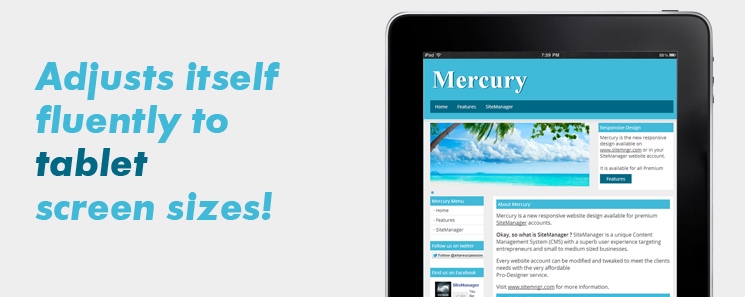
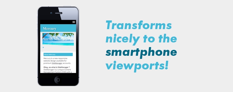
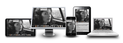
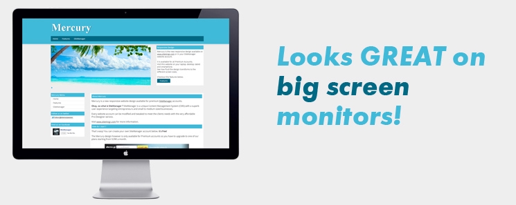
Visit this website on your laptop, desktop, tablet and smartphone.
See how flued the design transforms to the different screen sizes.

Checkout the features below.
Features
Mercury Menu
Follow us on twitter
Find us on Facebook
Responsive Design

The Mercury design wil fluently adapt to any screen resolution.


This technique is called responsive design. Visit this website with your smartphone, tablet and desktop and see how for your self how it works.

Personalisation

These are the extra elements that you can edit in this design

- Slider

- Content box next to the slider

- Sidebar with extra menu links

- Custom checkout button for a webshop website

- 4 Footer content boxes with links and plugins

- Credits line at the bottom

3 Color Versions

There are 3 color versions of the Mercury design available in SiteManager.


The Pro-Designer service can help you change this design to your housestyle.

More info on www.sitemngr.com.

Create your SiteManager account. Start for free.

Mercury | Mercury


Nederlands


Home
Features